Web Design Strategy: Turn Your Credit Union Website into a Branch

For far too long, credit unions have devalued their website by viewing it as a cost-center. We want to change that way of thinking and monetize your website by turning it into a branch! Given the uncertain future of branch traffic, what better time than now?
Often overlooked in a Credit Union's analysis of their tech stack is the most important electronic service you offer: your website. A well-designed website for your credit union is imperative now more than ever because it will need to speak to both members and prospective members who use your website in very different ways.
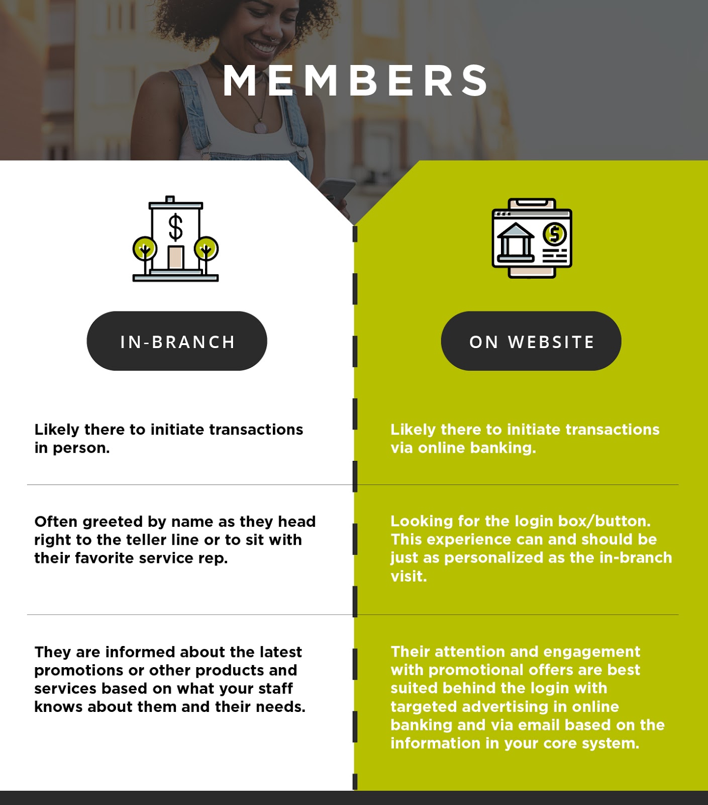
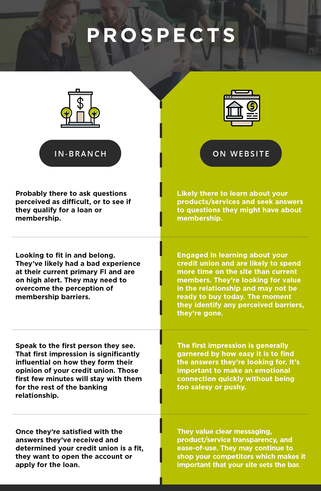
Think about your website traffic. For credit unions, there are typically two types of visitors: members who mainly visit the site for access to online banking, contact information, or a routing number; and prospects stopping by to shop your product offerings and rates, or to view your locations.
It’s important to recognize these two different types of visitors when thinking about the design of your website. Their experience with your website is not unlike what their in-branch experience might be.


Your website should be designed in a manner that reflects the needs of members and prospects accordingly. Their expectations are not that dissimilar from what they would be in a physical setting such as in the branch.
Key takeaways for credit union website designs:
- Not all web traffic is created equal.
- Those rotating promo banners on your site probably aren’t working.
- It should be easy for a prospect to start a relationship with your credit union online-- no we’re not talking about downloading a paper application.
- Reach current members where they are most captive-- in online banking or via email.
- Let website data and analytics tell you what’s important. Don’t guess.
- Treat your website like you would a branch. Map out the user experience online just as you would in-branch.
- Assign goals to your website and appoint someone to oversee the success of those goals.
The Pod takes an experience-first approach in web design. We seek to understand the behavior of your current site visits and merge them with the desires and goals of your credit union. Our recommendation is to value your website as a physical branch. In today’s digital world it makes sense to shift away from the traditional cost-center approach to one that demands monetization and profit. We can help! Contact us to learn more.
Sign up for newly harvested content transplanted from our minds to your inbox.


